The thing about pink we don’t see
How digital color technology brings us beyond simple image replication to active experience
Gayoung Lee • January 9, 2024

Pink is both an aesthetic and a channel for self-expression for Chaeri, a South Korean influencer. At her disposal are digital tools that enable storytelling with color [Credit: Chaeri]
Pink isn’t just a color. In the era of digital technology, pink is a lifestyle.
Just ask Chaeri, a South Korean influencer who wakes up to streaks of rosy pink light reflected off curtains drawn over valentine-pink comforters, slips into a pastel pink frock, grabs a strawberry latte topped with cotton candy pink whipped cream and stops to take a quick photo at a No Parking road sign — for no other reason than it was, well, pink.
But the pink palette dominating Chaeri’s feed is there for a reason. She says it’s an invitation into her life: memories of warmth and happiness wrapped in her favorite color.
Chaeri’s love for pink is what scientists call color signaling, or the use of certain hues to convey a message. From fish camouflage (“don’t find me!”), chameleons (“you’re a threat!” or “let’s mate!”) to the wings of monarch butterflies (“I’m poisonous!”), color signaling exists everywhere in nature. But humans seem to be alone in our strange fixation with getting colors just right.
“The human visual system is really good at focusing on a target and making it stand out,” explained David Hilbert, a philosopher of color science at the University of Illinois, Chicago. We care about producing the correct color, he said, so that “other people understand the message we’re trying to send them.”
Thanks to digital color technology — tools like editing softwares, color filters or AI-powered design programs — humanity has come far beyond the days of drawing with charcoal and red ochre on cave walls. We’ve moved from simple color manipulation to the utilization of color as expressions of complex human experience.
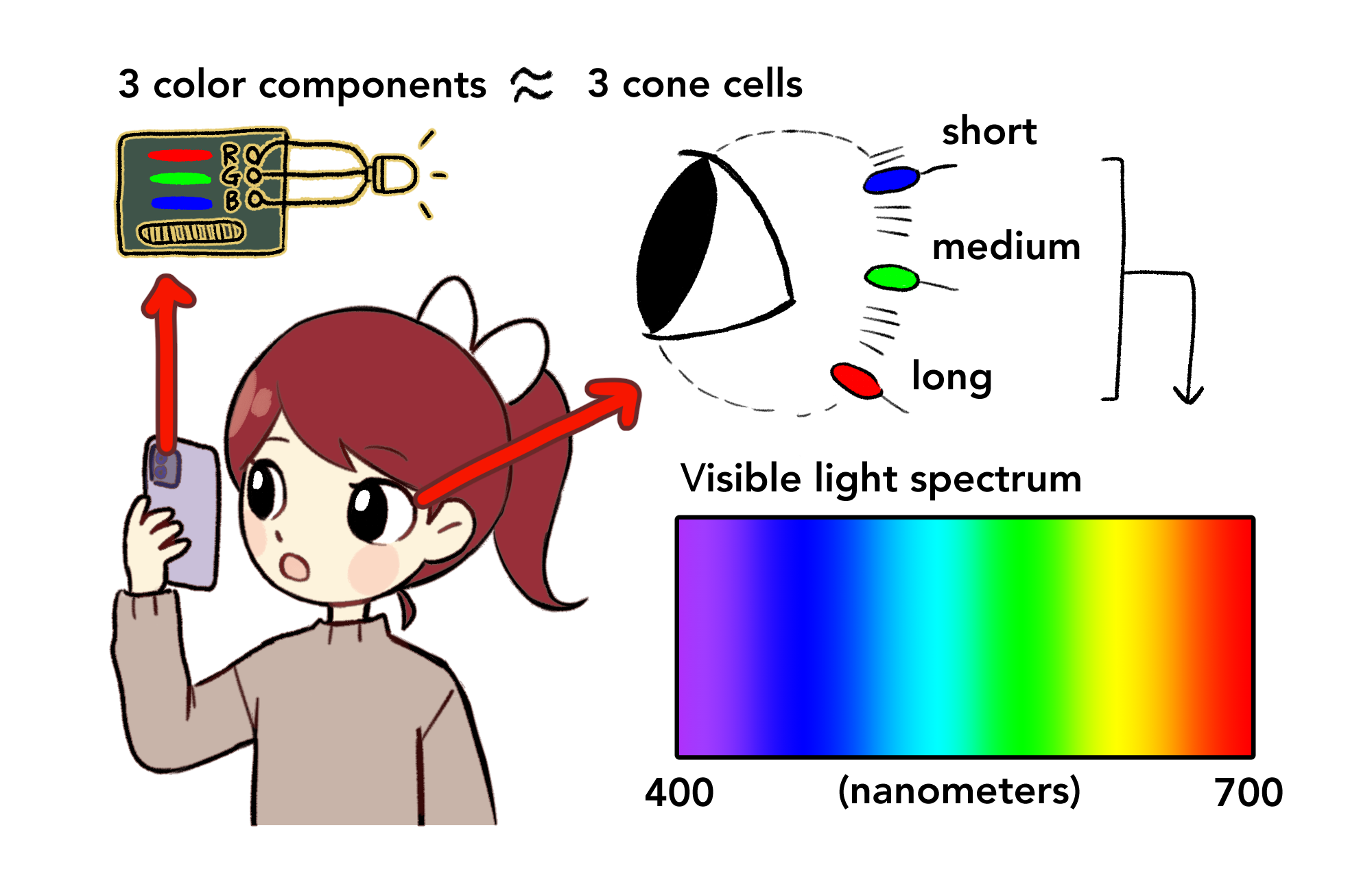
Perhaps one reason digital technology works so well to express color is that it’s based on how humans process color in the real world. Human color vision starts with three kinds of cone cells inside our eyes that respond to different wavelengths of light. There are about six million of these cone cells in a typical human retina, and their job is to identify and transmit to the brain light within the visible spectrum, with wavelengths ranging from 400 nanometers (violet) to 700 nanometers (red).
In a similar manner, computers have 31 components, each 10 nanometers wide, that generate light through three independent channels – red, green and blue – within varying light intensities to represent light wavelengths on the visible spectrum.

Three types of cone cells that respond to light in the visible spectrum are responsible for our initial perception of color. Likewise, a circuit board of our phone has three color components that light up in different intensities to express a certain color on the screen [Credit: Gayoung Lee]
While digital image creation takes a lot of inspiration from human physiology, that’s probably the least important part of digital color presentation, according to Charles Poynton, an independent color science researcher based in Canada. From an engineering perspective, generating certain patterns of light isn’t too difficult. The real challenge lies in linking an electronic display of an image with the way humans will perceive that image.
“The numbers describe the physical stimulus [images] really well,” he said. “But that doesn’t necessarily describe the appearance you register in the back of the head. Because that’s not really numerical.”
Making digital colors seem accurate extends into the zone of subjectivity, where “fuzzy biological neurons and synapses” take control over what we think we see, Poynton added. Replicating this requires some inspiration from neuroscience and psychology.
For instance, we have the idea that bananas are yellow. Attending a disco party and seeing an orange banana bathed in purple light wouldn’t immediately make us revoke the belief that bananas are yellow. Rather, our sensory experience (encountering an orange banana) is placed in the context of what we already might know about some object (bananas are yellow, and I am at a disco party).

This simulation of a banana on a windowsill appears to change color throughout the day, as the light changes. However, the ability of our brains to accommodate for changes in light intensity prevents us from thinking that the banana actually changed color every six or so hours [Credit: Gayoung Lee]
“That’s called color constancy — what makes things not dramatically change their color appearance as we move around in the world,” Hilbert said.
In this way, human color vision is more than just our eyes acknowledging and distinguishing between different wavelengths of light. When we take a photo on our phones, the color system inside senses light intensity to correct for balanced color distribution, roughly mimicking how the human brain accommodates for color constancy based on past experiences with similar objects. This is called chromatic adaptation.
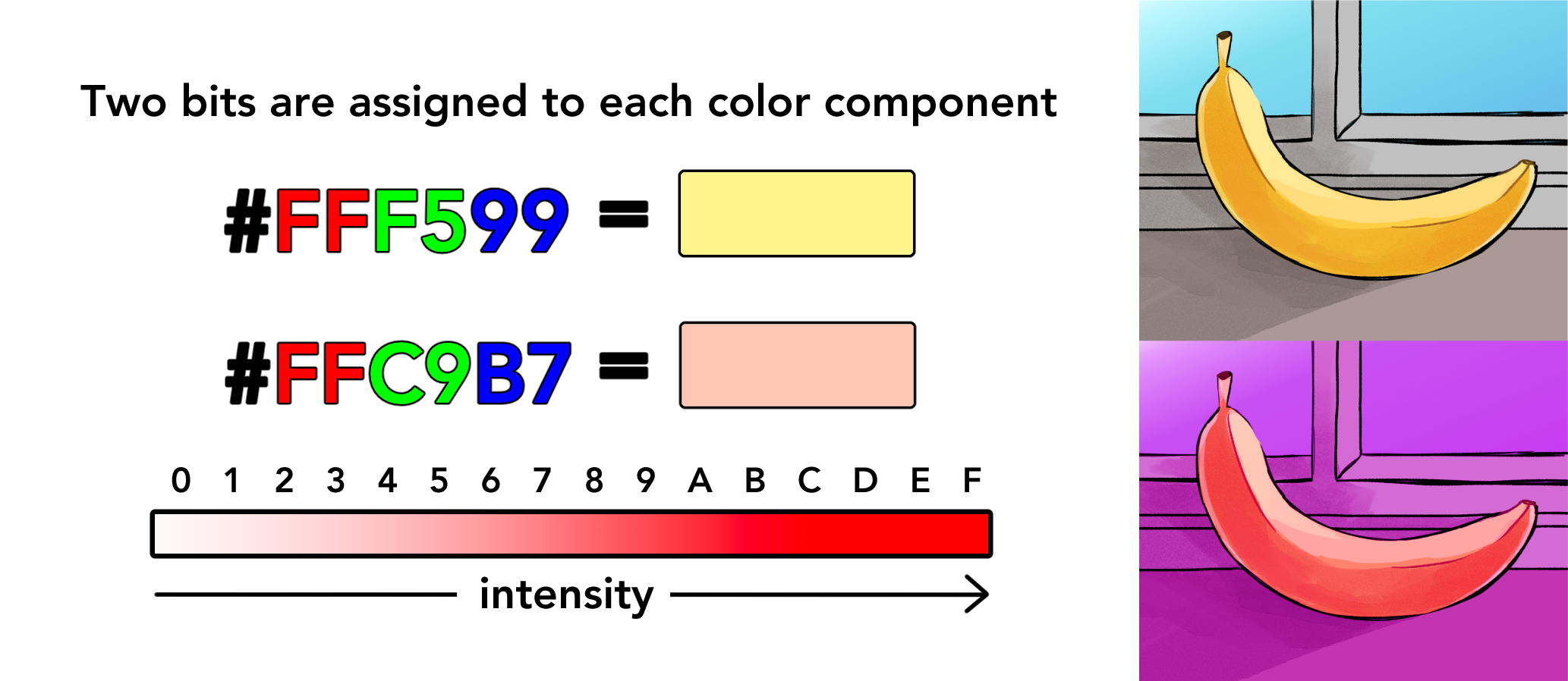
Computer systems do this by identifying colors with a six-digit code denoting the intensity of each basic component (red, green, blue) on a scale of zero to 15. Because one digit represents one bit, the smallest unit of information in computing, numbers from 10 to 15 are recorded as alphabetical letters from A to F. On this scale, white is #FFFFFF, since it has the greatest light intensity of every color component, while black, having the smallest intensity, is #000000.

Computers identify colors according to how intense the color is on the scales of red, green and blue. For example, a color with the highest intensity of red might have FF as the first two digits of the six-digit color code. [Credit: Gayoung Lee]
For the two bananas, the banana in daylight’s six-digit color code is #FFF599, while the disco banana is colored #FFC9B7. This shift in code represents a mathematical transformation according to the color value of a reddish light with a touch of blue. Accordingly, the disco banana has a stronger intensity of blue (B7), compared to the daylight banana (99), but a lower intensity of green (disco – C9, daylight – F5).
Some functions are not directly related to color but nevertheless contribute to how we perceive a colored image. Under the current color system, 24 bits are commonly allocated to color presentation. Often, some bits are unused and end up in what’s called the alpha channel, which accounts for transparency and blending inside images.
These extra bits smooth out the rough edges of digital images, allowing us to do things like check into our Zoom meetings with backgrounds placing us in space, Hawaii or inside the mouth of a giant cat. Filmmakers also employ the alpha channel to insert smoke or other elements while editing movies.
Poynton points out that these alterations are not true-to-pixel replications of what was in front of the camera, bringing us back to the question of subjectivity. What does it mean for a color to be right, anyway?
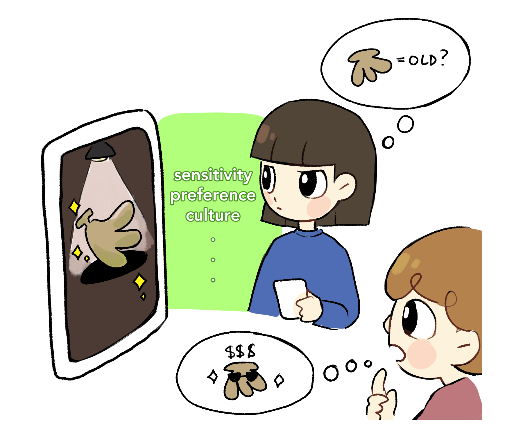
Consider two people who have different thoughts about the same photo of a banana colored dark yellow. One thinks that the banana is very old, and probably inedible, while the other happens to be a graphic designer who concludes that the image has been edited with a dark filter to add a sophisticated ambience to high-quality bananas.
Neither is necessarily wrong — it’s just their opinion. Is the banana a realistic color? Perhaps, both are right if there existed a rotten banana of a similar color. But if a banana-seller put that picture up to sell as many bananas as possible, the fact that the banana could look rotten to some viewers might mean this particular yellow is potentially realistic but not right. But say the banana-seller decides to change the display based on what psychology design books suggest is the most appealing to our appetite. This revised yellow might not be completely identical to a realistic yellow of a banana under daylight. Yet, if this yellow leads to higher banana sales, it may be a more persuasive, correct tone of yellow.

Two people looking at a banana colored #C0AA82, which is a brownish yellow. Is this color the right color for this banana display? According to color engineer Charles Poynton, that depends on what message the maker of the display wanted to convey [Credit: Gayoung Lee]
“It’s ‘accurate’ colors with respect to the story that they’re telling,” Poynton said. “You expect your [phone] to take beautiful pictures, but there’s no objective definition of ‘beautiful’ — there’s a very hazy area there.”
For Hilbert, that kind of haziness illustrates what he calls “one of the absolute beauties” of modern technology. We now have the choice, he said, to see a color-corrected digital photo and think, “Yeah, I don’t think that’s quite right,” using different tools to adjust color according to the message we want to convey.
Chaeri, the South Korean influencer, isn’t too familiar with the philosophy of color science, nor does she claim to be an expert in computer engineering. But she navigates the haziness of subjectivity with ease, adding a flush of pink to special moments in her life to share her story.
“The unedited camera version can’t fully express the emotion I went through at that time,” she said. “I want people to experience the same warmth I felt at that time. Because that’s just how pink makes me feel — and that’s who I am, what I want people to understand about me.”