INFOGRAPHIC: Urban HIV
As the World Health Organization changes HIV guidelines, a look at US cities
Ben Guarino • August 19, 2013

Earlier this summer, the World Health Organization (WHO) issued a new set of guidelines for treating HIV. To reduce the number of lives claimed by the disease, the WHO says countries need to administer antiretroviral therapy to patients sooner, after a smaller loss of lymphocytes. (Because HIV depletes the immune cells known as lymphocytes, counting these cells is one way doctors test for the disease.) Where might recent cases be found in the United States?
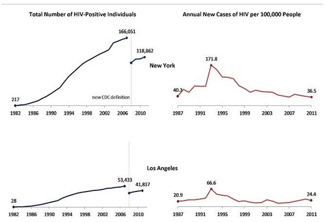
These charts are adapted from the Center for Disease Control and Prevention’s annual HIV surveillance reports. On the left, the total number of HIV-positive individuals in a city are tracked over time. On the right, the charts show the rates of new HIV cases in each city per 100,000 residents. Two things jump out: a decrease in total number of cases after 2007, and a large spike in the rate of HIV-positive individuals around 1993. In both cases, the CDC influenced how the data look. In 1993, the CDC’s definition of a new HIV case changed — patients with a smaller loss of lymphocytes were now considered to be HIV-positive, expanding the population. And in 2008, the CDC ceased reporting sums of HIV cases and instead began tracking the number people living with HIV, resulting in the general downward shift.
But what about Phoenix? Here, the total population of HIV-positive individuals is still rising, even with the CDC’s new reporting methods. It might be because Phoenix is one of the faster-growing large cities in the United States — from 2010 to 2012, Phoenix’s population increased at a rate almost 40% greater than New York’s. Cities like Phoenix and San Antonio — growing populations with historically lower rates of HIV — may want to be extra vigilant for new cases of HIV.
View the infographic below to find out more.
(Click to zoom)
