
My favorite kind of pie is pecan. My least favorite is chart.
Visualizing data is supposed to help you understand it better — a great graphic has the power to convey a lot of information clearly and compellingly. Pie charts, of course, are already limited in this regard. They showcase one type of data: percentages. Whether they even do it well is another question.
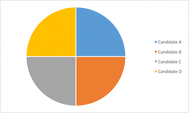
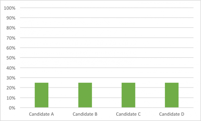
Let’s take a simple case. Let’s say there are a bunch of people running for president — say, four of them. Maybe a quarter of the population supports each of them. A pie chart can do that (although I’d argue that the bar chart below it conveys the point just as well).
But in the event, unlikely as it may be, that the candidates don’t have equal support, the pie chart’s advantage starts breaking down.
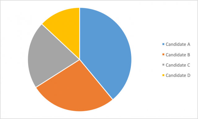
Do you have any idea what percent of the vote these candidates have? I don’t, and I made the thing. That means we’ll have to add labels.
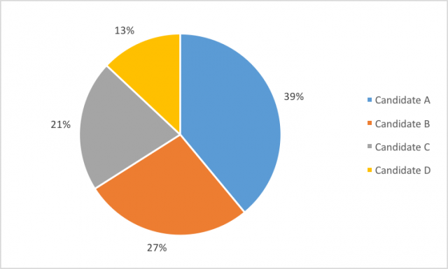
Setting aside for a moment that we’ve already lost the simplistic appeal of the pie chart, let’s focus on how difficult this is to read. You have to keep moving back and forth between the chart and the legend to tell which candidate has which chunk of the pie. We could put the candidates’ names next to the percentages, but that would look even worse. And the more candidates you add, the worse it gets.
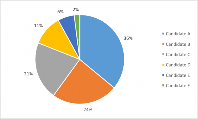
Maybe the pie chart above still looks nice to you, with its default Excel color palette and its expert use of negative space to separate the wedges. I’m guessing the folks at Microsoft designed it to be visually appealing. But tell me this: Do you have a sense of how 36 percent really compares to 21? What about 6 percent versus 21? It’s hard to really tell on an intuitive level. That’s because once you have more than three wedges, it’s hard to compare the ones that aren’t sitting directly next to each other.
And I know, I know — you could just look at the numbers. But at that point why wouldn’t I just use a spreadsheet to list them out? The whole point of making a visualization is to give the reader a more intuitive sense of the numbers. If the pie chart can’t do that, why bother with a chart at all?
I’d like to submit that the simplest, most effective way to communicate this data is with a bar graph.
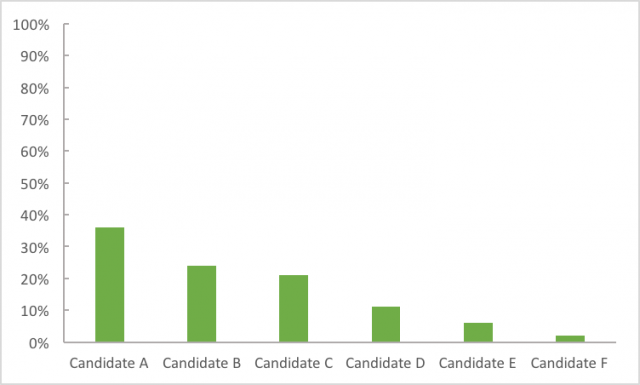
It’s clean, precise, accurate, and easy to read. The vertical axis provides you with the numbers, should you want them, but you still get a sense of how much support each candidate has without them.
And you’re not limited by needing to have a total of 100%. I could show you just the top three candidates. Or everyone with more than 10 percent of the vote.
I could go on (I haven’t even gotten to the abomination that is the 3-D pie chart) but for everyone’s sake I won’t. I’ll just leave you with this: Data visualization is an immensely powerful way to convey your point. Why not choose the best tool for the job?
Filed To
Share
About the Author
Sara Chodosh
Sara Chodosh is a graduate of the University of Pennsylvania, where she received a B.A. in neurobiology and philosophy of science. Perhaps the majority of her sentences begin excitedly with “did you know…” and the majority of her days end with a fond goodnight to her cat. Sara originally pursued cancer research as an undergrad, but now prefers teaching her friends about science and medicine while she bakes cupcakes.