Swapping goods for CO2 emissions in the global economy
What if we counted emissions based on where products are consumed, not produced?
Sylvia Tippmann • January 17, 2014
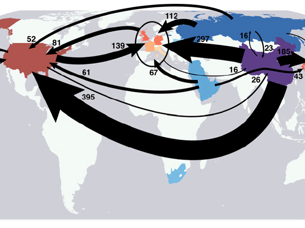
Carbon trading around the world. [Image credit: Steven J. Davis and Ken Caldeira, PNAS]
Pictures of Chinese cities choking in smog have been appearing more and more in the media. As the largest carbon emitter today and the world’s second biggest economy, China will play a major part in any global effort to ease climate change.
But at the recent climate talks in Warsaw, China, along with India and other developing countries, insisted that only “historical” emitters such as the European Union and the United States – the countries responsible for most of the warming so far – should have to cut their carbon emissions.
Although per capita emissions in China are approaching the level of some EU countries, most Chinese still live a relatively low-carbon lifestyle. While 797 out of 1000 Americans own a car, in China this number is only 85. What’s wrong with this picture?
Have a look at the label on the T-shirt you are wearing. Most likely it says ‘Made in China’ – meaning it was made in a Chinese sewing factory likely run on coal-derived energy. Those don’t count as U.S emissions; they count toward China’s total emissions budget. So, goods get shipped around the world but their carbon emissions stay within the producing country.
But what if we counted emissions based on where products are consumed, not produced? A study from the Carnegie Institution of Washington in California did just that, using data from 2004. You can see a simplified map of global product trade from their paper above.
The Carnegie map is nine years old, but another research team led by Klaus Hubacek from the University of Maryland shared with me some more recent data. For each country, Hubacek’s team took into account both imported and exported goods to generate more factual carbon emission levels. They started off with CO2 emission per country, measured in terms of production. Then they added emissions coming from imported products and subtracted emissions from exported products. They ended up with country-by-country CO2 emission measures based on actual carbon consumption. Now a pair of Nikes sold in America but produced in China, count on the emissions of the U.S., where they are worn, and not on the emissions of China, the producing country.
The results are thought provoking. Based on Hubacek’s spreadsheets, I made a graph comparing the carbon emissions of the U.S., Canada and some other high-income countries from Europe to China, a developing country. The left panel shows each country’s CO2 production per capita. As shown, China has similar per person emission levels as some European countries. However, China is also the biggest product exporter, and if it could eliminate the CO2 associated with those exports – and other countries had to include the carbon associated with their imports – the situation would change drastically. The right panel, taking into account these changes, shows that China’s CO2 consumption is in fact well below the French, Italian or Spanish and less than half of the average Swiss CO2 consumption, although they all appear about equal in CO2 production levels.
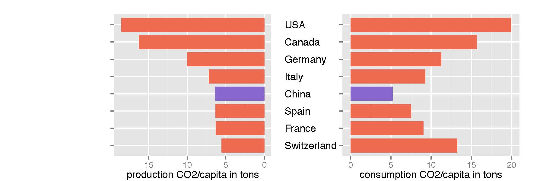
[Data Source: Kuishuang Feng & Klaus Hubacek, University of Maryland.]
Americans, Canadians and Germans are the highest CO2 emitters in this group. But that is only part of the truth. The right graph reveals that the relatively high CO2 emissions per capita should be even higher considering what citizens of these countries actually consume. Around 10 percent of their CO2 emissions are actually outsourced to producing and exporting countries, like China.
The bottom line is that the developing world, exemplified by China, consumes much less carbon than it produces, while the opposite situation prevails in North America, Europe and other developed countries.
So, next time you see pictures of Shanghai covered in smog, remember that a lot of that pollution is caused by your iPhone, your Nikes and your t-shirt.
Filed To
Share
About the Author
Sylvia Tippmann
Originally from Germany, Sylvia Tippmann did not come to science writing on a straight path. She followed her science mind and curiosity, studied Bioinformatics and Genome Research in her undergrad, moved to Australia for the Master’s and finisihed her PhD in Switzerland. In between differentiating stem cells, swimming in the Rhine and presenting her research on international conferences she found her passion in communicating science through smart diagrams, sketches and words. Now, Sylvia is aiming at turning that joy into a profession.
3 Comments
Nice article! Very well written and very timely.
A few comments:
1) What year does the Feng & Hubacek data reflect?
2) Your CO2 production/consumption graph is really helpful but the axes are slightly different which is a little distracting.
the data used here is for 2010
Hello, I was wondering if you could link me the study that Klaus Hubacek did? I can’t seem to find it online. I’m doing a presentation on localization of production and consumption and would love to use his data (cited of course). Thank You :)